Watercolor Calligraphy Tutorial: Blending Ink and Watercolor Step-by-Step
Table of Contents
There’s something almost magical about the moment watercolor and calligraphy ink meet on paper. The colors bloom and blend in ways you can never quite predict — and that’s exactly what makes this combination so beautiful and so addictive.
In this watercolor calligraphy tutorial, I’m going to walk you through three core techniques for blending ink and watercolor together: wet-on-wet blending, color gradients within each stroke, and ink-watercolor layering. Whether you’re picking up a brush pen for the first time or you’ve been lettering for years, these methods will open up a whole new dimension of creativity in your work.
If you’re looking for more ways to combine these two mediums, check out my post on 6 Ways to Pair Calligraphy with Watercolor — it’s full of inspiration for every skill level. And if you’re just getting started with drawing fundamentals to complement your lettering practice, Improve Drawing has fantastic beginner tutorials worth exploring.
What You’ll Need
Before we get started, let’s gather our supplies. Having the right tools makes all the difference when blending two different mediums together.
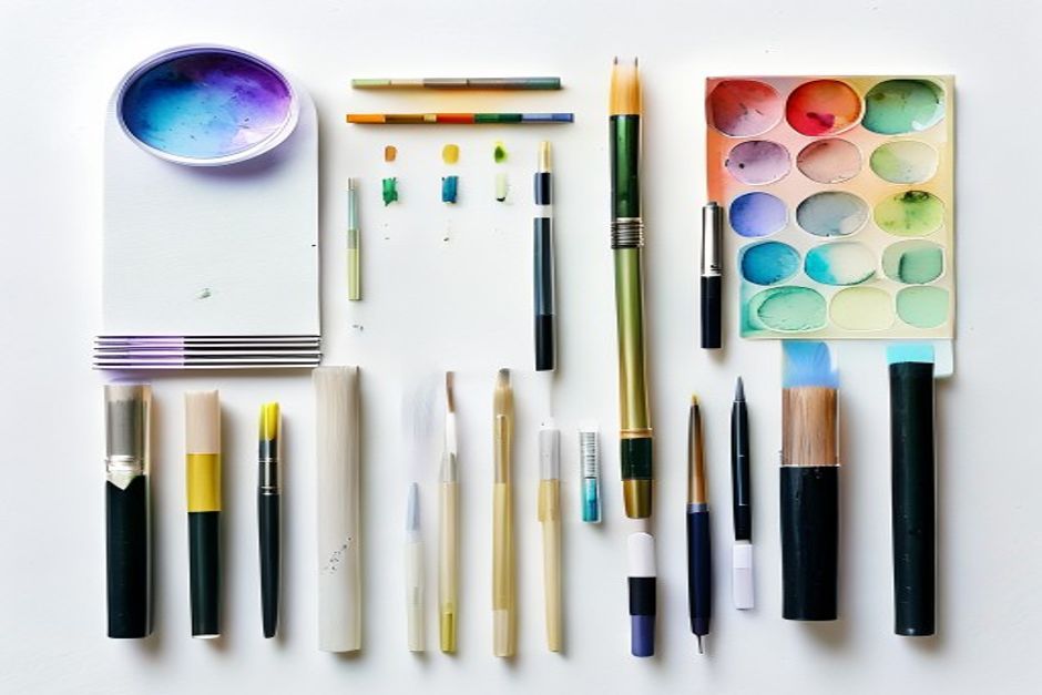
- Watercolor paints — A Winsor & Newton Cotman set is perfect for beginners and gives you rich, blendable color
- Water brushes — Pentel Aquash water brushes are a go-to choice; they hold water in the barrel so you can control the flow
- Brush pens — Tombow Dual Brush Pens work beautifully for calligraphy and come in gorgeous colors
- Calligraphy ink — Dr. Ph. Martin’s Bombay India Ink or a similar liquid ink gives you clean, dark strokes
- Watercolor paper — This is non-negotiable. Regular printer paper will buckle and bleed. Use a Strathmore 400 Series Watercolor Pad or similar cold-press paper
- A water cup and paper towels — For rinsing brushes between colors
- Pencil (optional) — For lightly sketching your lettering guidelines before inking


Got everything ready? Let’s dive in.
Technique 1: Wet-on-Wet Watercolor Calligraphy
Wet-on-wet is the most organic of the three techniques — the one that produces those dreamy, unpredictable results where colors seem to have a life of their own. The key is timing: you want to add ink to a surface that’s still wet enough to let the two mediums react together.
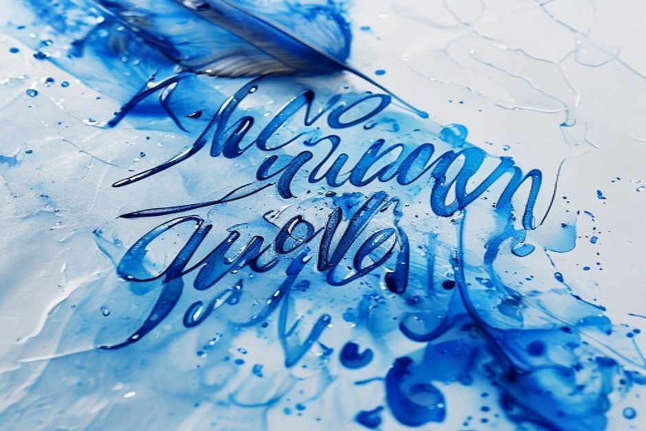
Step 1: Lay down a watercolor wash
Load a medium or large brush with plenty of water and lay down a wash of watercolor across your paper. Use one color or blend two to three colors together while they’re still wet. The wash should be damp and shiny — not puddling, but definitely not starting to look matte. Work fast.
Step 2: Add ink while the wash is still wet
This is where the magic happens. While the watercolor wash is still shiny and wet, pick up your water brush loaded with calligraphy ink and begin writing your letters or words directly into the surface. The ink will bloom and feather outward — sometimes dramatically, sometimes subtly, depending on how wet the paper is. Those unexpected soft edges are the hallmark of wet-on-wet. Embrace them.
Step 3: Let it dry completely
Resist every urge to adjust anything once you’ve placed your ink strokes. Let gravity and water do their work. If you want to speed up drying, use a hairdryer on a low, cool setting — but hold it far enough away that you don’t push the ink around.
The result: soft, watercolor-kissed lettering with bloomed edges that simply can’t be replicated any other way.
Technique 2: Color Blending Within Each Stroke
This technique creates a beautiful gradient within individual calligraphy strokes — perfect for single words or short phrases where you want each letterform to feel luminous and multi-toned.
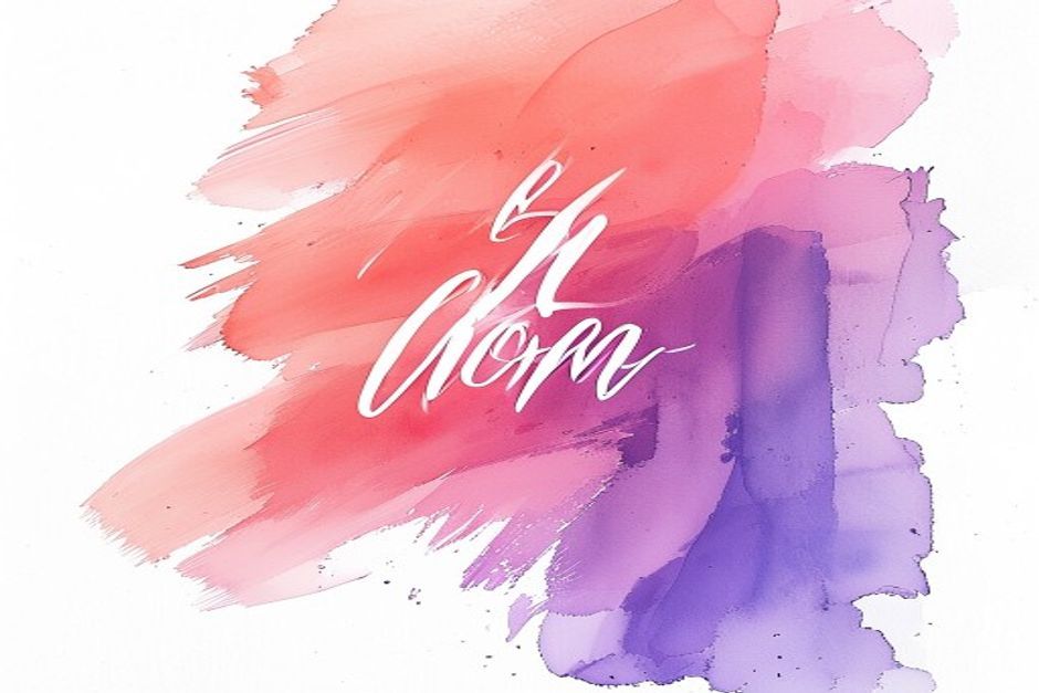
Step 1: Double-load your water brush
Fill your water brush barrel with clean water. Then, using a damp brush, pick up two colors from your watercolor palette — one on the very tip of the bristles and one further back. Warm-cool pairings work beautifully here: coral and violet, golden yellow and teal, or blush pink and deep indigo.
Step 2: Letter without rinsing between strokes
Begin lettering without rinsing the brush. As you work, the two colors naturally blend within each stroke, shifting from one hue to the other. The transition is never quite the same twice. To intensify the gradient, reload your brush frequently — picking up the lighter color first, then barely touching the tip to the darker tone.
Step 3: Deepen with a second pass
Once the first layer is dry, go over certain strokes with a more concentrated version of one color to add depth and definition. This is especially effective on the downstrokes of classic calligraphy, where the stroke naturally thickens — a touch of deeper color there adds beautiful dimension.
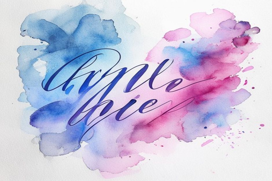
Technique 3: Ink-Watercolor Layering
Layering brings together the precision of calligraphy ink and the luminosity of watercolor by working in two distinct stages: a watercolor background first, then ink calligraphy on top once it’s fully dry. The contrast between the soft, painterly background and the crisp letterforms is stunning.
This is a method I first explored in my post on How To Create Watercolor Calligraphy Blended With Ink — where a happy accident turned into one of my favorite techniques.
Step 1: Paint your watercolor background
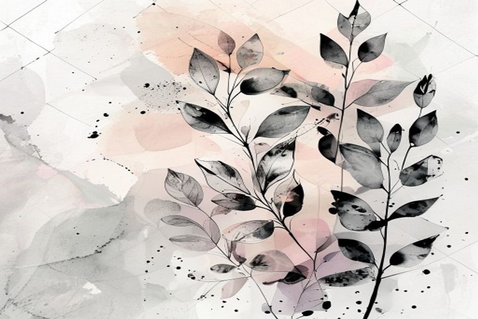
Create a loose, expressive watercolor background using two or three harmonious colors. You can go abstract with soft gradients, or paint loose botanical elements — leaves, flowers, or loose organic shapes. This layer doesn’t need to be perfect; it just needs to set a mood. Let it dry completely before moving on.
Step 2: Write your calligraphy over the dry background
Once the watercolor is fully dry, letter your word or phrase on top using a brush pen or dip pen loaded with calligraphy ink. The ink will sit cleanly on the surface, creating crisp, defined strokes that contrast beautifully with the soft layers beneath.
For bold contrast, use black or white ink over colorful backgrounds. For something more understated, choose an ink color that complements rather than fights with your watercolor palette.
Step 3: Add a final accent (optional)
Once everything is dry, add a final light watercolor wash or splatter to unify all the layers. A subtle spatter of a complementary color across the finished piece adds movement and makes the whole composition feel intentional — without covering your lettering.
Tips for Success
- Always use watercolor paper. It’s designed to handle wet media. Regular paper will buckle, bleed, and tear.
- Test your colors on scrap paper first. Watercolors look very different wet versus dry. A quick swatch test saves your final piece.
- Dedicate one brush to watercolor, one to ink. Mixing mediums on the same brush muddies colors and compromises ink flow.
- Let each layer fully dry before adding the next. Especially for the layering technique, patience pays off. A slightly damp surface will cause bleeding where you don’t want it.
- Practice your letterforms before mixing in watercolor. The calligraphy-watercolor combination is most rewarding once the lettering itself feels natural. Even 10 minutes of warm-up drills makes a real difference.
Go Make Something Beautiful
Watercolor calligraphy rewards curiosity above all else. Every time you try it, you’ll discover something new — how ink behaves differently on wetter versus dryer paper, how colors shift as they dry, how one small change in your brush angle can produce a completely different effect.
Start with the layering technique if you’re a beginner; it gives you the most control and the most predictable results. When you’re ready to play, try wet-on-wet and let the paper surprise you.
Share your watercolor calligraphy creations in the comments below or tag us on Instagram — I’d love to see what you make!
Related Reading: If you enjoy working with ink and watercolor together, check out pen and ink with watercolor wash techniques from Improved Drawing — a detailed guide to creating layered wash effects over ink drawings.
Leave a Reply