Table of Contents
Introduction
Today we’re delighted to feature an article from Jennifer Hines, a seasoned lettering artist and freelance illustrator originally from Chicago, IL, now embracing the expat life in London. Her techniques are remarkably intuitive and her methods practical for artists at any level. Whether you’re just starting out or looking to refine your skills, you’ll find value in this ‘Back-to-Basics’ tutorial. If you’d like to work with Jennifer, you can check out here
Understanding the Structure of the Letter A
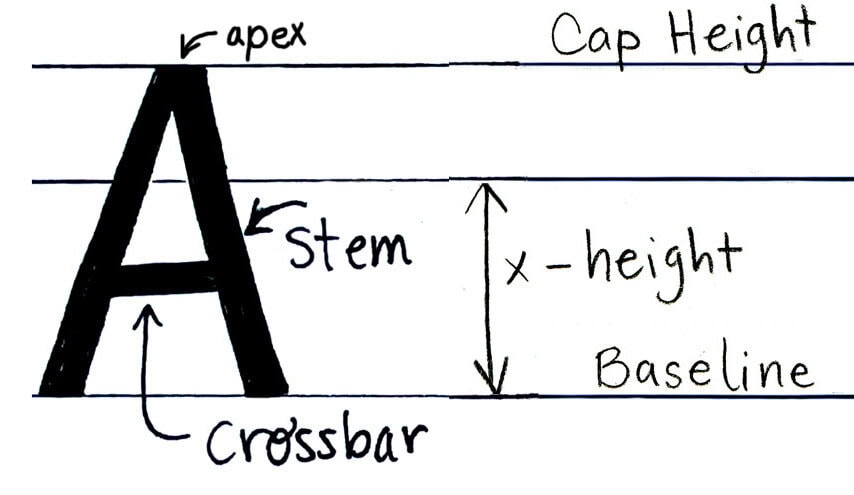
Ready to level up your hand-lettering skills? Let’s start with the basics. While drawing the letter A might seem straightforward, it’s actually one of the more challenging letters to master, especially for beginners. Let’s explore some techniques to help you perfect this fundamental character.
The key to drawing a great ‘A’ is to forget everything you know about it. Instead of seeing it as the familiar letter you’ve known since childhood, view it as a collection of geometric shapes. A capital ‘A’ consists of three essential elements: two diagonal stems that meet at the top, and a horizontal crossbar. The stems create a symmetrical triangle, while the crossbar cuts through them to form a smaller triangle in the upper portion of the letter.
Steps to Draw the Letter A
1. Using a Font Reference
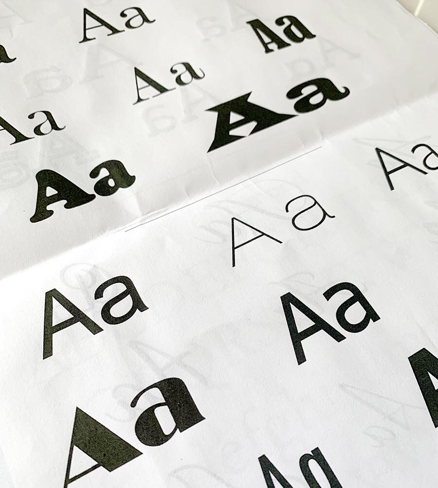
But how do we draw this? Let’s look at a reference to make sure we form it properly instead of leaning on our prior knowledge. What if you had never seen a letter A, how would you draw it? It’s best to use an existing font, like those on your computer, and observe its parts to really see how a letter A is formed. This may seem like something you should know, but there are nuances you might have never thought about, such as which side is thicker and thinner, whether the top is pointed or squared off, and where exactly to put the crossbar.
Looking at a real font on your computer will help you analyze the letter proportions and see how it is put together. Go into Word or another program, type up some capital letter As, and choose a few different fonts. Make the letters large so you can see them clearly. What do you notice about the various fonts? How are they different? Which do you like best? Choose one font as a basis for your drawn letter A. Use a real font reference from your computer or Google to observe a letter A and how it is formed, rather than relying solely on your memory.
- Which side is thicker and thinner?
- Is the top pointed or squared off?
- Where do I put that cross bar?
Looking at a real font on your computer will help you look at the letter proportions and how it is put together and see the shapes that make up the form. So go ahead: go into Word or another program, type up some capital letter As, choose a few different fonts from your computer, and make them large so you can see them clearly.
2. Drawing Your Skeleton
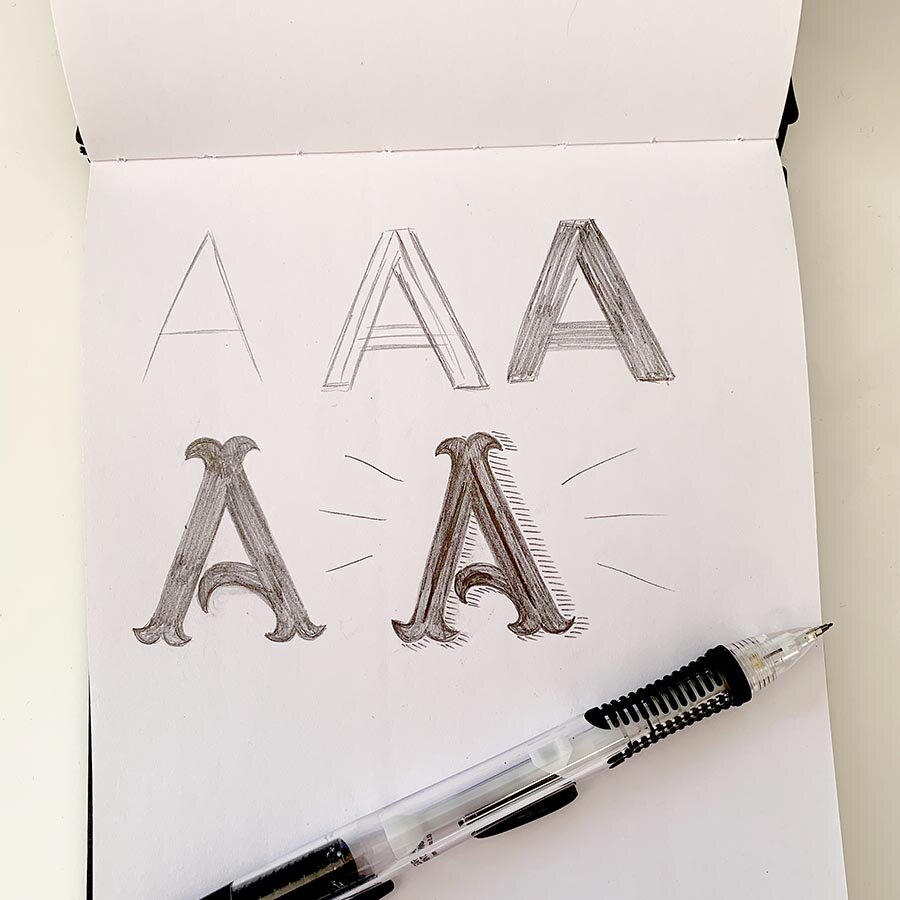
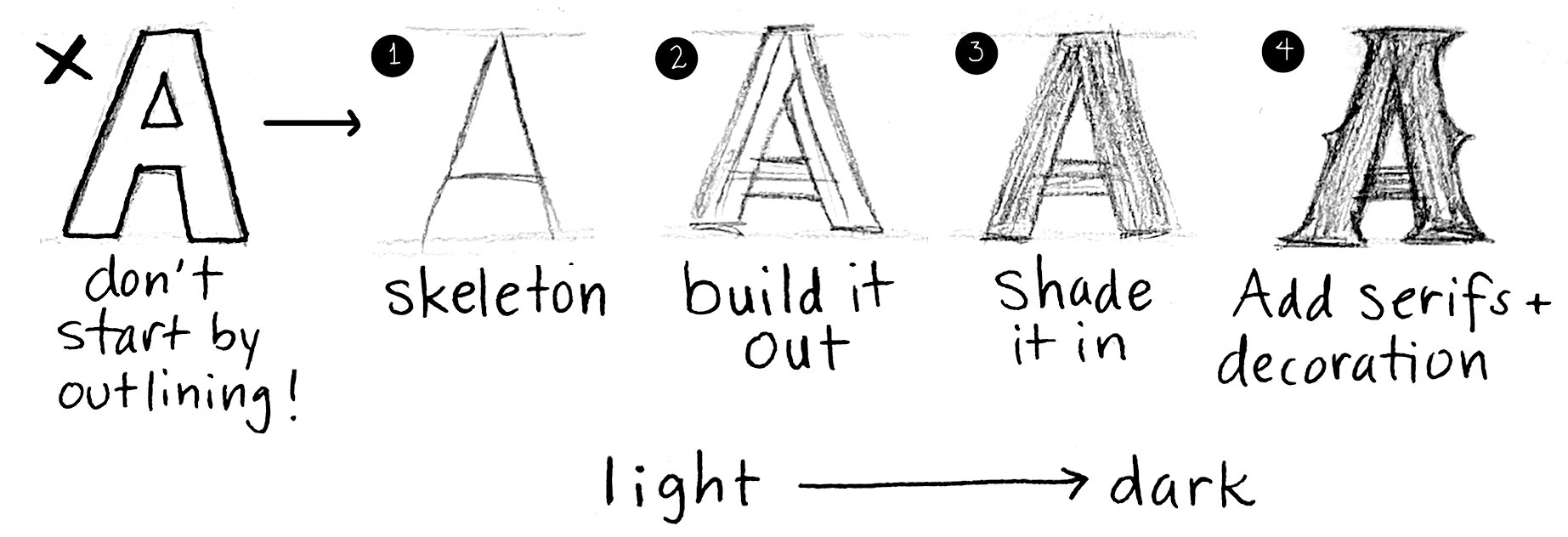
Once you’ve chosen a font to reference and studied its proportions and form, you can start drawing your own. Begin with a skeleton a light, single-stroke representation of the letter. Even if you plan on having a bold letter, it’s best to start with a skeleton to make sure you’ve formed your letter correctly.
Avoid starting with an outline, as it can be hard to see the shapes when they aren’t filled in. Starting with a skeleton ensures you have the proper proportions before moving on to more detailed work.
3. Adding Weight and Fine Details
The next step is to add weight lightly, filling in the letter to compare the thickness to the example. Starting with the outline is hard for maintaining proper proportions, so instead, focus on building out the skeleton. Shade in the letter to see the full form and check the thicknesses.
Once the weight is added, fine-tune your work. Add any serifs, those little tweaks at the bottom of the stems if your font reference has them. You can also think about adding patterns or decorations inside the letter, or shadows outside the letter.
Start lightly and add more pressure as you go to darken the lines, making it easier to erase and self-correct as needed. Drawing letters is about drawing, erasing, and redrawing until the shape and proportions look just right.
Common Mistakes to Avoid
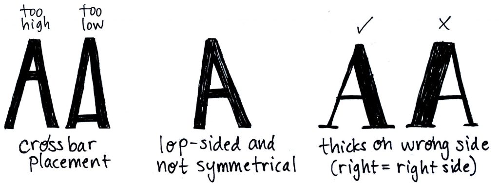
As you draw, avoid the common pitfalls for the capital letter A:
1. Putting the crossbar too high or low
Putting the crossbar too high means the triangle inside the top of the A is small, which makes the letter hard to read. Too low and it’s large with not much below it, so the letter is also hard to read. The crossbar can be flexible a bit on placement, but aim lower rather than higher. It won’t be at the exact middle, but most likely a little lower, and will need to be even lower for bolder thicker letters than for thinner delicate letters.
2. Make sure your letter angle is symmetrical
While some italic fonts may not be symmetrical, most regular fonts will be for the letter A. Imagine a piece of pizza, it’s pretty much a perfect triangle with the two longer sides the same and the point in the middle. Make the angles of the R and L stems the same for capital As until you are comfortable with moving to more difficult and italic letterforms.
3. Avoid putting the thick side on the left.
This is such an easy mistake to make—you start with the left stem so make it the thicker one. But in a capital letter A when there is a pronounced thicker side, it is ALWAYS on the right. Right = right!
While it’s great to use a reference to draw a letter from start to completion, that’s just copying an existing letter. What about if you want to make it personalized? My advice is to start with the reference to get your proportions down, then put it away and add some adjustments to make that letter your own.
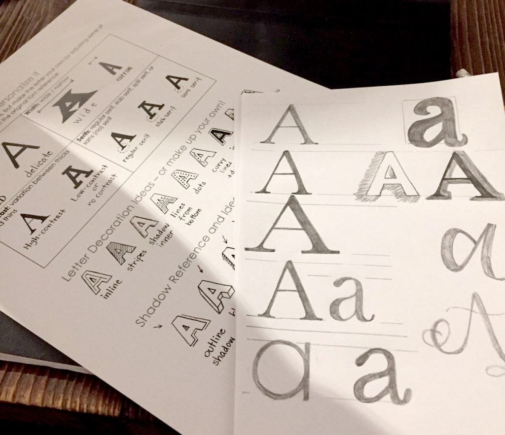
Personalizing the Letter A
Personalize it! Things you can adjust to make a letter your own (rather than just copying a reference):
- Make it bolder (heavier) or more delicate (light) than the reference.
- Adjust the width–make it wider or narrower than the reference.
- Adjust those thicks and thins–maybe the thicks get way thicker and thins get way thinner, or maybe you adjust so that there’s nearly no difference at all.
- Add, change, or remove the serifs. This has a signficant effect on bringing that letter away from the original and personalizing it.
- Or, use your imagination! What else can you change?
Conclusion
To sum up, learning to draw letters takes practice and observation–starting with a real font reference is a great way to begin, but add some of your own adjustments to make the letter a unique piece of art that you’ve come up with. And keep practicing! With each letter A you draw, you’ll see your skills improve!
Have fun lettering the letter A in all sorts of styles!

Leave a Reply