Table of Contents
In this tutorial, you’ll learn how to draw bubble letters and how to have fun doing it. We’ll start from the basics and will take it a step further to show you how to boost your creativity. Some concepts we’ll dive into can be used in other styles too. Let’s get started.
 To create something a bit more permanent, you can use any pen or marker. I’ll be using a Rotring Art Pen, but you can choose something else you have at home.
For the final touches, I’ll be using Photoshop and a Wacom Bamboo Pen. But you can mimic everything I’ll do with markers, Posca pens, Copic Markers, etc. We’ll go into it a bit more in-depth later.
To create something a bit more permanent, you can use any pen or marker. I’ll be using a Rotring Art Pen, but you can choose something else you have at home.
For the final touches, I’ll be using Photoshop and a Wacom Bamboo Pen. But you can mimic everything I’ll do with markers, Posca pens, Copic Markers, etc. We’ll go into it a bit more in-depth later.
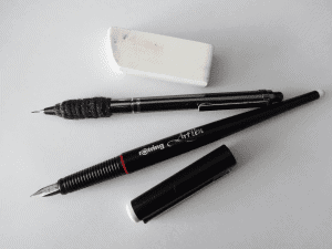
 As you can see in the image, it’s not good to start with a cramped letter. The width must leave enough room to work around. And don’t open the letter too much either. If you have a hard time knowing, start with something and see how it goes. If you see it’s too tight or too spread out, you can always restart.
This A is your skeleton. You’ll erase it later, but it is the most important part of this tutorial since it’s the base for what will come next. Remember, everything we’ll learn for this A can be used for any other letter, number, or symbol.
As you can see in the image, it’s not good to start with a cramped letter. The width must leave enough room to work around. And don’t open the letter too much either. If you have a hard time knowing, start with something and see how it goes. If you see it’s too tight or too spread out, you can always restart.
This A is your skeleton. You’ll erase it later, but it is the most important part of this tutorial since it’s the base for what will come next. Remember, everything we’ll learn for this A can be used for any other letter, number, or symbol.
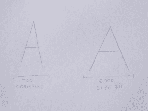
 As you can see by the image, we have a rounder shape for our A. It isn’t exactly perfect, but it is a start. Now, let’s improve on it. What we want to achieve is a form with more personality. Like this next example.
 If you’re interested in something a bit less round and the first one looks dull to you, mix them up. Here’s when your imagination can fly.
As you can see above, you can maintain the straightest shape on the outside of the A and give it a rounder feel inside. That way you have a bit more room while still being legible and interesting-looking.
If you’re interested in something a bit less round and the first one looks dull to you, mix them up. Here’s when your imagination can fly.
As you can see above, you can maintain the straightest shape on the outside of the A and give it a rounder feel inside. That way you have a bit more room while still being legible and interesting-looking.
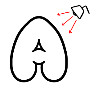
 First, we need to define the light source in our drawing. You have to imagine light coming from somewhere. Usually, we use diagonal directed lights coming from the top right or the top left corner. But you can use it regardless of the direction, as long as you adjust the shadow and glow to match the intended direction.
 After you have the light source defined, let’s start shading. You can shade on top of the letters or behind them. Let’s learn both processes.
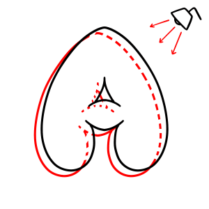 The way to achieve this result is to add the visible part of the shadow behind your A. You can redraw the entire letter with a pencil if it helps you.
Remember, you have to follow your light source. The way to do that is to distance the shadow further from the light source but in the same direction. See the image below.
The way to achieve this result is to add the visible part of the shadow behind your A. You can redraw the entire letter with a pencil if it helps you.
Remember, you have to follow your light source. The way to do that is to distance the shadow further from the light source but in the same direction. See the image below.
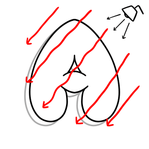 Draw as many guides as you need until you get the hang of it.
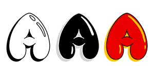
Now, after the light source, we need to accent the brightness. Just like you see in a bubble or a balloon. The glow is of course a part of the letter, so you must shadow on top of it. Here are some examples.
Draw as many guides as you need until you get the hang of it.
Now, after the light source, we need to accent the brightness. Just like you see in a bubble or a balloon. The glow is of course a part of the letter, so you must shadow on top of it. Here are some examples.
 As you can see, regardless of the style you choose, the same rules apply to every situation.
Since we’re talking about shadows and depth, you can just as easily create a 3D letter with it.
As you can see, regardless of the style you choose, the same rules apply to every situation.
Since we’re talking about shadows and depth, you can just as easily create a 3D letter with it.
 The same technique you use for the outline shadow, you can use to turn your shape from 2D into 3D. The only difference is you’re going to connect the shapes from the shadow and the letter every time the direction changes. Then, you cover it. See the image below.
 The reason why these don’t work so well with bubble letters is because you can see the biggest differences when using sharp edges, like we see in the middle of the A here. When the letters are straight you have a better perception. Nonetheless, here it is in case you want to try it!
Learn a bit more about cast shadows using perspective.
The reason why these don’t work so well with bubble letters is because you can see the biggest differences when using sharp edges, like we see in the middle of the A here. When the letters are straight you have a better perception. Nonetheless, here it is in case you want to try it!
Learn a bit more about cast shadows using perspective.
 For the inside shadow techniques, you’ll apply the same rules as before, with a few twists.
The main difference is, your shadow will work inside the letter. You’ll need to imagine it has the same curves as a balloon or a bubble. You have a lighter side that catches the light from the light source and a darker side that catches no light.
The trick with this one is using a gradient shadow, so you can feel the roundness of it. Opposed to the bold shadow we’ve seen before.
Realistic form and cast shadows can be learnt more in depth to develop this skill further.
For the inside shadow techniques, you’ll apply the same rules as before, with a few twists.
The main difference is, your shadow will work inside the letter. You’ll need to imagine it has the same curves as a balloon or a bubble. You have a lighter side that catches the light from the light source and a darker side that catches no light.
The trick with this one is using a gradient shadow, so you can feel the roundness of it. Opposed to the bold shadow we’ve seen before.
Realistic form and cast shadows can be learnt more in depth to develop this skill further.
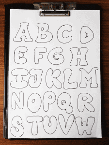 You can also make fonts now! Here are some bubble letter fonts you can check out to get some inspiration:
www.hipfonts.com/bubble-fonts/
You can also make fonts now! Here are some bubble letter fonts you can check out to get some inspiration:
www.hipfonts.com/bubble-fonts/
What are bubble letters?
For the unfamiliar, bubble letters are letters that have a rounded or inflated effect. Just like bubbles. You can also think about them as letter balloons. There are many uses for this style, and you’ll learn mostly examples on paper and a bit in digital form. The same techniques apply. Nonetheless, it is a style used a lot in other ways, like graffiti. So, let’s dive into it!What do you need to get started?
Since we’ll start with the basics, all you need is a pencil and paper. In my case, I’ll be using a mechanical pencil. You can also add a rubber if you want to clean everything up nicely.
To create something a bit more permanent, you can use any pen or marker. I’ll be using a Rotring Art Pen, but you can choose something else you have at home.
For the final touches, I’ll be using Photoshop and a Wacom Bamboo Pen. But you can mimic everything I’ll do with markers, Posca pens, Copic Markers, etc. We’ll go into it a bit more in-depth later.
1 – How to start drawing bubble letters (Skeleton)
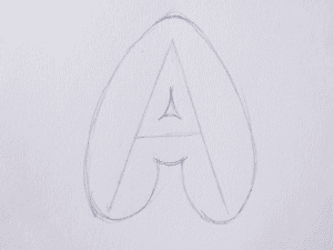
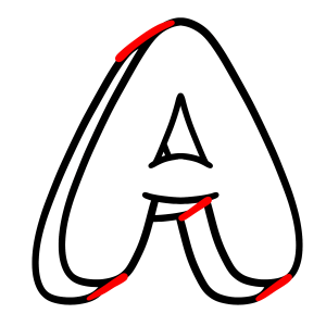
Draw a normal letter
The way to start drawing Bubble Letters is to draw a normal letter. I’ll start with a capital A, but you can choose any other letter. You just have to apply the same principles.
As you can see in the image, it’s not good to start with a cramped letter. The width must leave enough room to work around. And don’t open the letter too much either. If you have a hard time knowing, start with something and see how it goes. If you see it’s too tight or too spread out, you can always restart.
This A is your skeleton. You’ll erase it later, but it is the most important part of this tutorial since it’s the base for what will come next. Remember, everything we’ll learn for this A can be used for any other letter, number, or symbol.
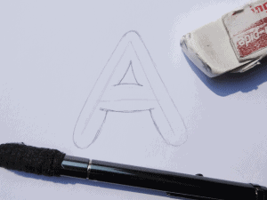
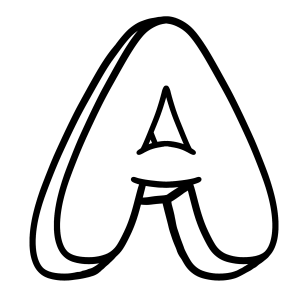
Draw outside the shape
What we’ll do now is essentially draw outside of your A shape, with a fair distance. The idea is that you round all hard shapes, like the edges and vertices where edges meet. Draw around them and avoid hard shapes. Be as soft as you can with your lines.
As you can see by the image, we have a rounder shape for our A. It isn’t exactly perfect, but it is a start. Now, let’s improve on it. What we want to achieve is a form with more personality. Like this next example.
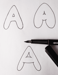
Exaggerate the bubble shape
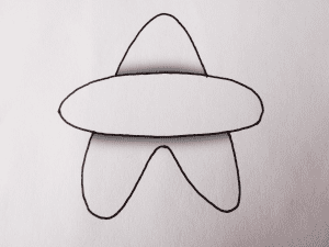
Let’s start with our A skeleton again. But this time, let’s exaggerate our exterior and interior shapes. Think of them as balloons. The way it is now it’s like a clown balloon, the one used to make animals and swords. But it’s not fun, or comic-like yet. Take a look at the next image. On this one, you see more character. It’s like the A got inflated. It’s more bubbly looking, right? How do we reach this? First, accentuate the forms. Round up the larger sides, with different widths. On each edge go from a lower width size to a bigger one, and back to the first. If you do it all around you’ll end up with something like the image. Don’t forget to do the same on the inside, even if you don’t have enough room. Round up your lines so you give the sense that it has no more space to blow up.Add details to the bubble letter: extend the edges
As a final touch, you can extend the edges that connect, to give the illusion that one part of the letter is on top of the other. In this case, you can see it clearly on the bottom line of the middle edge of the A.
If you’re interested in something a bit less round and the first one looks dull to you, mix them up. Here’s when your imagination can fly.
As you can see above, you can maintain the straightest shape on the outside of the A and give it a rounder feel inside. That way you have a bit more room while still being legible and interesting-looking.
2 – How to create depth in bubble letters
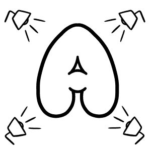
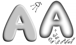
Define a light source
Typically, the way to create depth in any style of drawing is by using linear perspectives with vanishing points and/or by the use of shading. For this tutorial let’s learn how to add shades and glow to our letters. If you want to know more about light and shadows used in art, check out the beginners guide to shadow light drawing.
First, we need to define the light source in our drawing. You have to imagine light coming from somewhere. Usually, we use diagonal directed lights coming from the top right or the top left corner. But you can use it regardless of the direction, as long as you adjust the shadow and glow to match the intended direction.
After you have the light source defined, let’s start shading. You can shade on top of the letters or behind them. Let’s learn both processes.
Outside Shadow (Cast Shadow)
I’m going to use photoshop from now on, but you can use your pencils, Copic markers, etc. The important part is to follow the instructions. Regardless of the format.
The way to achieve this result is to add the visible part of the shadow behind your A. You can redraw the entire letter with a pencil if it helps you.
Remember, you have to follow your light source. The way to do that is to distance the shadow further from the light source but in the same direction. See the image below.
Draw as many guides as you need until you get the hang of it.
Now, after the light source, we need to accent the brightness. Just like you see in a bubble or a balloon. The glow is of course a part of the letter, so you must shadow on top of it. Here are some examples.
As you can see, regardless of the style you choose, the same rules apply to every situation.
Since we’re talking about shadows and depth, you can just as easily create a 3D letter with it.
The same technique you use for the outline shadow, you can use to turn your shape from 2D into 3D. The only difference is you’re going to connect the shapes from the shadow and the letter every time the direction changes. Then, you cover it. See the image below.
The reason why these don’t work so well with bubble letters is because you can see the biggest differences when using sharp edges, like we see in the middle of the A here. When the letters are straight you have a better perception. Nonetheless, here it is in case you want to try it!
Learn a bit more about cast shadows using perspective.
Inside Shadow (Form Shadow)
For the inside shadow techniques, you’ll apply the same rules as before, with a few twists.
The main difference is, your shadow will work inside the letter. You’ll need to imagine it has the same curves as a balloon or a bubble. You have a lighter side that catches the light from the light source and a darker side that catches no light.
The trick with this one is using a gradient shadow, so you can feel the roundness of it. Opposed to the bold shadow we’ve seen before.
Realistic form and cast shadows can be learnt more in depth to develop this skill further.
3 – Have fun with different styles of bubble letters
Before we end the tutorial, it’s important to remember you can and should use your creativity to boost your work. Try drawing different letters with different shapes and come up with different versions. This will help you be versatile with your work.
You can also make fonts now! Here are some bubble letter fonts you can check out to get some inspiration:
www.hipfonts.com/bubble-fonts/
Registrácia
Your article helped me a lot, is there any more related content? Thanks!