Table of Contents
Brush lettering is gaining popularity because of its similarity to traditional forms of calligraphy, like pointed-pen calligraphy, but is more accessible because of the ease of use of materials—no messy ink, no metal nibs, etc.
This course is perfect for brush lettering beginners: for those of you who want to dive into brush lettering but have no idea where to start.
This is a comprehensive mini course so you can get all the beginner info in one spot:
- Materials you’ll need
- Brush lettering basics
- Individual letters
- Letter pairs
- Full words and sentences
- Recommended next steps
As you practice your work, remember to post your progress on Instagram and tag us with #LetteringLeague and #LLBrushLetteringBasics!
What you need to get started brush lettering
Introduction to brush lettering materials and supplies
Before we get into brush lettering itself, let’s talk about materials and supplies you may need. I want to remind you that the tools do not make the artist. You can literally pick up anything you have, whether it’s a pencil or a ballpoint pen, or a brush lettering pen. It really doesn’t matter. It’s important to master the basics first. However, knowing what’s available to you can help you learn and grow faster.
Okay, so let’s talk about pens, paper, and accessories.
Brush Lettering Pens + Writing Implements
Let’s talk about pens and other writing implements. While a brush calligraphy look can be achieved with a ton of art supplies, I’m only going to focus on the tools that will give you a true brush calligraphy experience, meaning supplies that will provide the thick and thin strokes that are loved in the brush lettering community.
First, let’s talk about nib types. In brush calligraphy, the piece that applies the ink to the paper is called the nib. A nib can be made out of various materials, which lends itself to a different brush lettering experience and different results.
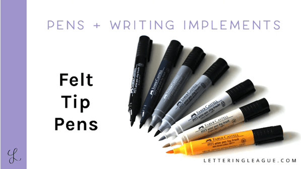
First, we have felt tip pens. These are great for beginners. They’re firm and provide more control than bristle brushes. The durability of the felt tip pens will vary, especially when combined with the stroke pressure and smoothness of the paper you’re using.
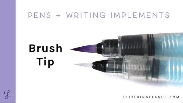
Another nip type is the brush tip. Natural hair brush pen, synthetic hair brush pens, and paint brushes are made up of individual bristles of hair. They’re significantly more flexible than felt tip pens and can be a little bit harder to get used to. They can provide really beautiful results. Nylon tips are generally more durable and affordable and will bounce back to their original form after pressing hard and after a decent amount of use
When choosing a tool, you also want to take into account the nib size. These can be fine, medium or broad. This is judged usually by the range of sizes it creates. So you need to think about: what is the thinnest thin stroke you’ll need, and what’s the thickest thick stroke you’ll need.
Because brush calligraphy depends on a ratio of thick and thin strokes, the pen size will determine the size of your letters. So the broader the pen or marker, the bigger your letters will be.
Finally, when you’re choosing a brush pen, you want to think about its elasticity. So you can also talk about the nibs elasticity in terms of firmness. So how well does the tip bounce back after a significant amount of pressure is put on it? Is it really flexible or is it more firm? In general, a brush tip is going to be more flexible, while a felt tip is going to be more firm. A good felt tip pen is going to have high elasticity with low fraying, which means it’ll last a lot longer.
Let’s talk about ink types really quick. In the world of ink, there are a few key questions to ask. Is it waterproof? Is it archival? How saturated is the color, and what does the ink flow like? Is it water-based, pigment based, or alcohol based? And are there a lot of colors available?
Some of the most popular types of marker pens are water based simply because they’re going to be the least expensive. Because these pens are water based, they’re not going to be waterproof though.
Archival ink is designed so it will resist fading and weathering. So if you’re creating commissioned art and selling originals, you’ll want to use archival ink so your artwork will be beautiful for years to come.
So waterproof ink will ultimately allow you to protect your art from spills. And it’ll also allow you to layer it with other supplies like watercolor. Alcohol-based pens are best known for being quick-drying and permanent. The first pens that come to mind are our friends, the Sharpie markers. And yes, they make these in brush pen tips. Alcohol-based markers and pens can be applied to a multitude of weird surfaces like acrylic, plastic, glass, and other similar non-paper materials.
You also want to think about ink flow. So the ink flow will depend on the newness of the tool at hand. So a newer pen will be more moist than an older pen and some pens and markers have a lot of ink flow right off the bat.
Paper
Okay now time for paper. So when you’re just getting started with brush lettering, it’s really important to have paper with guides on it. This will help you to consistent strokes and will save you time from setting up guides on every practice page for lettering drills.
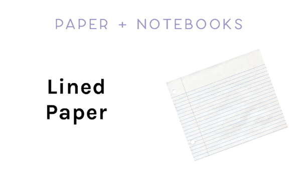
So, you can start with lined paper. This is really easily accessible and a great way to start practicing. You can either grab a yellow, legal pad or a really cheap composition notebook, and you’re well on your way to doing your brush lettering drills.
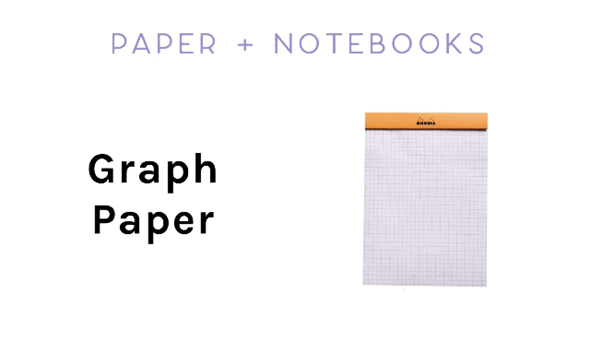
Graph paper can help you learn more about visual space between letters because of the vertical lines. In addition to the horizontal lines, I personally love the Rhodia graph paper pads because the paper is really smooth and the lines are lighter and less then in less expensive graph paper notepads.
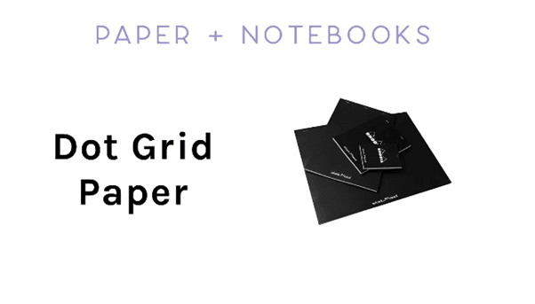
For those of you who want the control and guidance of graph paper without the distracting lines, dot grid paper is the way to go.
When you’re ready to take your brush lettering to the next level and go freehand, you can grab a stack of copy paper and get going.
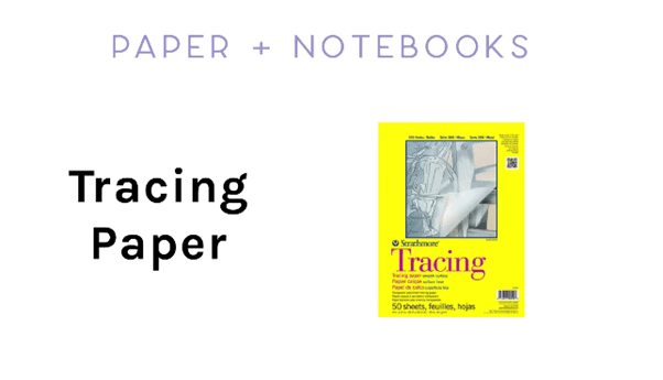
The last type of paper then I want to go over is tracing paper. It’s a great option for practicing over lined or good at paper. You can also use tracing paper to practice over printed material in order to try different styles. A lot of talented brush letterers developed the personal styles by tracing over other people’s work to help them develop muscle memory for different letter forms.
Brush Lettering Accessories
This is the last section to talk about materials before we dive into brush lettering. This section covers accessories and anything you might need to organize your supplies.
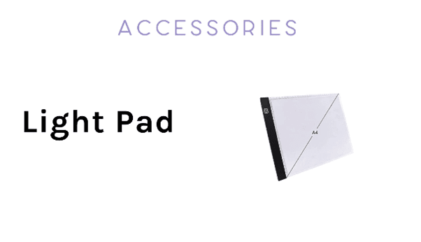
First, we have a light pad or sometimes it’s called a light box. So a light pad is a piece of equipment that’s shines light through a flat surface so you can place many layers of paper on top of it and see the marks underneath, instead of maybe using tracing paper.
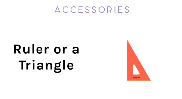
So a ruler or a triangle is great if you want to create practice pages with guides, especially if your paper is blank. The acrylic triangle is really awesome, especially if you want to save time drawing guides on every sheet. With a triangle, you can create one angled calligraphy guide so that you can work on the angle and consistency of your brush lettering and use it with a light pad. If you want more information on how to create your own calligraphy guide, you can check out this video.
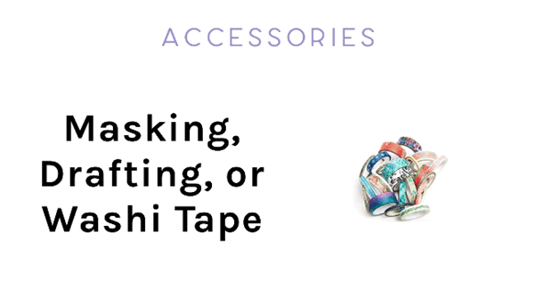
Masking tape, drafting tape, or washi tape is really awesome if you’re working with multiple sheets of paper layered on top of each other, either just on your desk or on top of a light box. It just helps you make sure that your paper doesn’t move around.
The last accessory that I’ll mention is a pen roll. And this is really great because it helps you organize all your pens and it allows for them to be portable as well.
That’s it for materials. Let’s now hop into brush lettering basics!
Brush Lettering Horizontal Guide
Learn about the 5 basic horizontal guides you need to know and become aware of when practicing basic brush lettering:
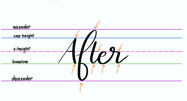
- Baseline
- Cap Height
- X-Height
- Ascender Line
- Descender Line
Now, I know this doesn’t look like lettering yet, but before we dive into it, we really need to focus on the guides. These are your horizontal guides that you need for brush lettering, and they’re really guides that you need for any sort of lettering.
The green line down at the bottom is your baseline. This up here is your cap height, and this is your x-height. You’ll see when you’re drawing any type of letter, it’s important to adhere by these horizontal guides.
Let’s just draw a capital “A,” and then a lowercase “A.” And you’ll see that the letters go all the way up to the cap height. They all line up at the baseline. And they all also line up at the x-height with the crossbar, for the “A” and also the top of the lowercase “A.” And this will help you with consistency when you’re doing lettering.
In terms of brush lettering, though, there are also two lines that you need to take into consideration. This one is your ascender line, and this one is your descender line. When you’re doing brush lettering, you also need to pay attention to these two.
I’m going to go ahead and write the word “after” you so you can see what I mean.
You can see with this word here, they all line up on the baseline. The capital “A” goes up to the cap height. Your ascender for the “F” goes all the way up to the ascender line and back down to the descender line. The “T” crossbar meets at the x-height. The loop for the R goes a little bit above the x-height. We’ll go through all of these with the basic strokes, and then once we start drawing individual letters, but I just want you to be mindful of these lines as you begin brush lettering.
You don’t need to draw these lines on every single piece of practice paper that you make, but it’s just helpful to keep in mind that you want your letters to all line up with the baseline and the x-height and the cap height, and also your ascender and descender, before you start getting into something more complicated like bounce lettering.
Brush Letter Basic Strokes
And it’s time to get into brush lettering!
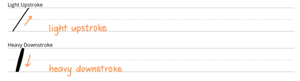
The first thing you need to know is that any stroke that goes down is going to be a heavier stroke than an upstroke. So what I mean by this, is any stroke like this, going down on the paper is going to be a heavy stroke. This is where you apply a lot of pressure. Any stroke that goes up is going to be a light stroke. So you want to make sure you can get those varying widths between your heavy down strokes and your light upstrokes.
So the first stroke I want to cover is this stem stroke. And this is a good anchor for a ton of letters. So this is just a simple stroke that goes down like this. And you can see that by practicing, you want to work on your consistency of the spacing between your stems, as well as the angle of the stems. You can also work on the consistency of the thickness of the stems.
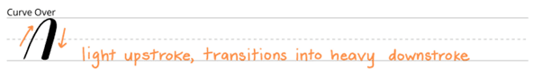
Next, we have our curve over, and this is simply a light stroke that transitions into a heavy downstroke. So we have a light upstroke that transitions into a heavy downstroke.
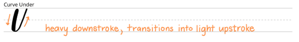
Next, we have the curve under, which is a heavy stroke that transitions into a light upstroke.
Well, I mentioned the stem stroke up here. Most stem strokes in brush lettering are actually going to be a curve under simply because you need what is called an “exit stroke” in order to continue the letter.
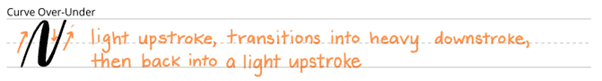
Next, we have the curve over-under. So what this is, is combination of the curve over and the curve under combined into one shape. So you see, you have a light upstroke transition into a heavy downstroke and then transitioned back into a light upstroke.
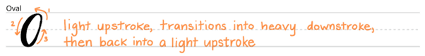
One of the most difficult strokes to master is the oval stroke, simply because there’s two transitions in it, but because it’s an oval, sometimes it just feels more difficult than a curve over-under. So you start here and then you go light upstroke and transition slowly into a heavy downstroke, and then transition slowly back into a light upstroke. You can see by going slower, you actually are able to perfect those transitions. So make sure when you’re doing your drills to take this slow, especially if you’re not getting the results that you want.
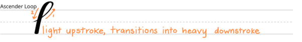
We have our ascender loop, which we’ll start usually at the baseline or sometimes the x-height, but either way you have a light up stroke that transitions into a heavy downstroke.
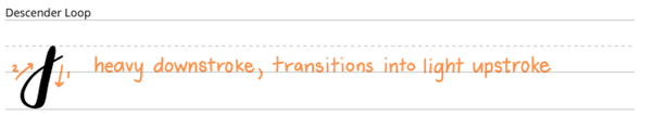
And then similarly, we have the descender stroke, which is a heavy downstroke that transitions into a light up stroke.

Other things to master are entrance strokes and exit strokes. And you want to make sure that when you’re doing brush lettering, that you have them be more connected, just like cursive. So when thinking about the letter “A,” you start with the oval stroke, and then you end with a curve under, which is essentially an exit stroke. So you have a heavy downstroke that goes into a small exit stroke. But you also have an entrance stroke, which goes into the heavy downstroke of the first part of the “A.” So altogether it looks like this.
We’ll go over this more when we get to joins, but you can see how the tail of the exit stroke… it’s usually covered up by the next stroke of the next letter.
Drawing Individual Brush Letters
It’s time to learn how to draw individual letters!
Brush Letters That Begin with Basic Strokes (I, J, M, N, P, T, Z)
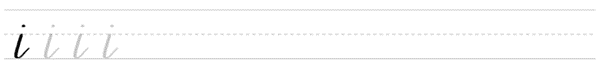
In this first module, we’re going to be focusing on letters that start with a basic stroke. So the first one is “I.” “I” is simply a stem that pulls down, goes up to an exit stroke, and ends with the dot.
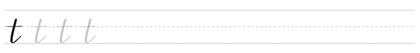
Similarly, we have “T” which is the same sort of shape with a crossbar. And it’s obviously a little bit taller than your “I.”
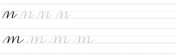
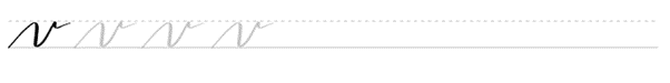
A letter that starts with a curve over is “M” and “N.” So you see if you have one curve over and then add one more with an exit stroke, you have your “N.”
And then similarly, if you do a curve over and another curve over, and then finally a final curve over with an exit stroke, you have your “M.”
A similar letter is the “Z,” which has one curve over stroke, and then a smaller curve over stroke that goes into a descender loop.
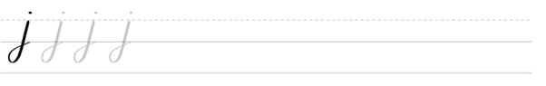
Since we’re on descender loops, we can move into drawing the “J” which is a simple descender loop with a dot, just like the “I.”
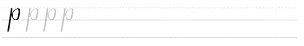
A P is simply a longer stem followed by an oval that’s attached to it.
Brush Letters That Begin with Ascender Strokes (B, F, H, K, L, R, S)
Now we’re going to be looking at letters that begin with ascender stroke. And again, the ascender stroke goes up to meet the ascender height and then goes down.
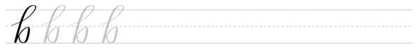
So a letter that starts with an ascender stroke is a “B.” So we start here, bring the stem straight down, and then just like we did the “P,” just add a bump. So it’s kind of like an “O,” but it’s a little backwards.
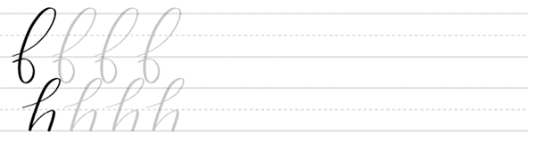
Next, we have the “F,” which is a little bit more complicated because you have to do a little bit more planning ahead, but you basically start at the baseline, move up. When you get to the ascender height, pull down heavy and then finish at the baseline again like that. So ultimately you have two transitions here, one at the top at the ascender and down at the descender height. And then you just go into your exit stroke there. Similarly to the “B,” we also have “H” which is an ascender stroke, and then a curve over.

“K” is also similar. Whether you draw your “K” like that, or a little bit fancier like that, it’s up to you.
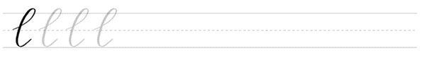
Next, we have an “L.” Just simply an ascender stroke that loops into an exit stroke.
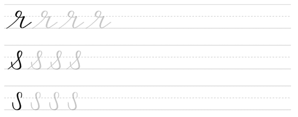
“R” and “S” are a little bit different from the rest of these, simply because they don’t reach as high in the ascender stroke that the other ones do. But in “R,” see, this is the cap height right here, or I’m sorry. See, this is the X-height right here. And this is the baseline right here. You want to bring your “R” start from the baseline, go a little bit above the X height, pull down, and then go back up to the X height and then pull down to finish the letter.
And then similarly, we have the “S” which also does something similar to the “R” where it starts at the baseline, goes above the X height, and then finishes down here. I personally draw my “S’s” like this, but that’s just up to you. So just practice the way you want to be drawing your letters, and you can always mix it up.
Again, as you’re practicing these, make sure to download the workbook and print it out and you can follow along.
Brush Letters That Begin with Curve Over-Under Strokes (U, V, W, X, Y)
Now we have the letters that begin with the complex stroke curve over-under. So this is the “Y,” the “V,” “W,” “X,” and also the “U.”
So here we go. Start with the curve over-under for “V” and then it simply has a small exit stroke.
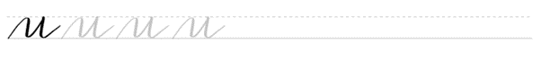
For the “U” we have a curve over-under that ends with a regular stem/exit stroke.
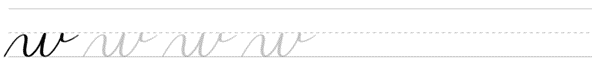
The “W” we have a curve over-under, another curve under, and then an exit stroke, just like the “V” up here.
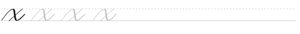
The “X” is a little bit different in that it has a curve over-under but doesn’t quite reach the top. And then we have a light cross.
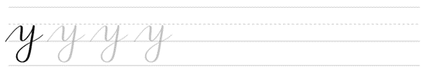
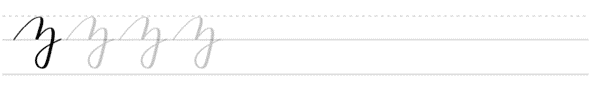
Finally, we have the “Y,” which is a curve over-under, and then a descender loop.
Brush Letters That Begin with Oval Strokes (A, C, D, E, G, O, Q)
And then finally for individual letters, we have letters that begin with oval strokes.
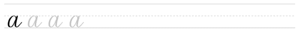
So again, the oval stroke starts with an “O” like that, but then let’s say we wanted to do an, “A” we just add a stem stroke with a small exit stroke.

Next we have “C,” which is an incomplete oval stroke. So start here transition down to a heavy stroke and then come back up.
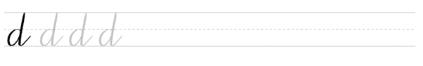
Next we have a “D” which is an oval stroke combined with a downward stroke and a small exit stroke.
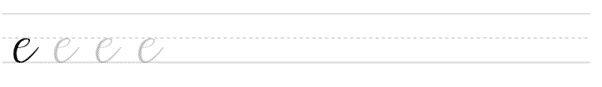
Similar to the “C,” We have the “E,” which is essentially a little bit of a curve here that transitions into an oval stroke.
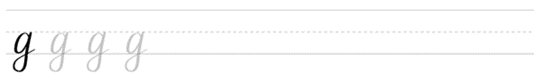
Next, we have a “G,” which is an oval stroke with a descender loop.
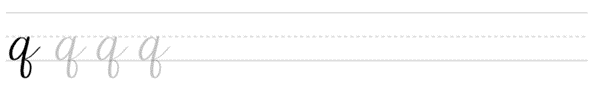
The “Q” is also similar in that it’s an oval stroke with a descender loop that goes the other way.
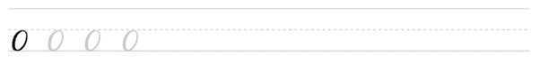
And of course we just have plain and simple “O.”
Next, we’re going to be looking at how to pair all these letters together with joins and then also write out full words.
Brush Letter Joins + Letter Pairs

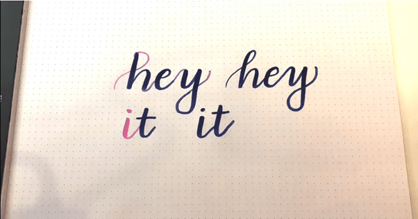
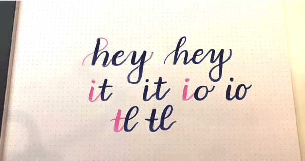
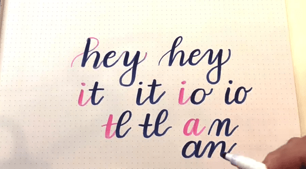
Simple Joins occur with an exit stroke between each letter. A great example is the letter pair “it.” Notice how the tail of the “i” is overlapped by the stem of the “t.”
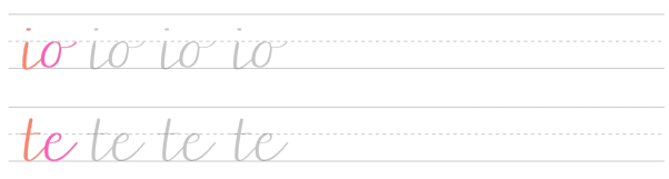
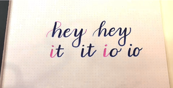
Joins to Ovals is similar to a simple join: the broad stroke of the next letter overlaps with the tail of the previous letter. This can take a little more practice because it requires more aim. Some examples are “io” and “te.”
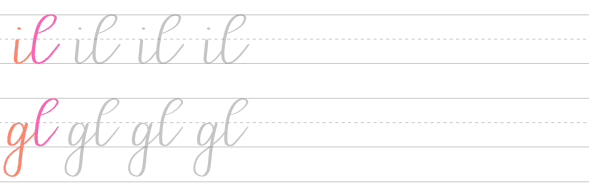
Joins to Ascender Loops are similar to the ones we covered so far, except that you’ll pick up your pen at the x-height line, then start your next letter at the x-height line and complete your ascender loop. Some pairs are “il” and “gl.”
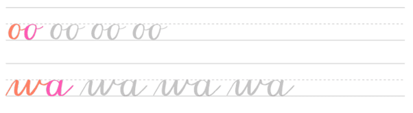
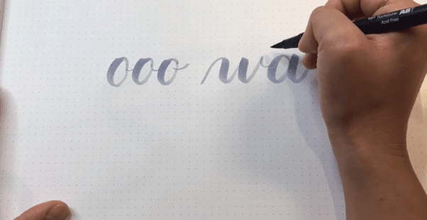
Horizontal Joins are the ones from letters like “o,” “v,” and “w” that don’t go back down to the baseline before the next letter starts. These are pretty simple and follow the same rules as simple joins: the broad stroke of the next letter covers the tail end of the exit stroke of the previous letter. Try “oo” and “wa.”
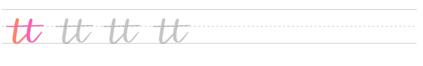
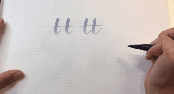
Crossbar Joins happen where letters with crossbars are finished with one crossbar instead of two. This pretty much only applies to “tt.”
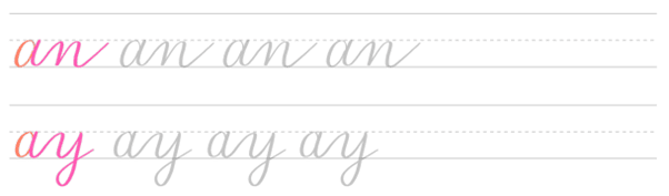
Joins to Curves happen where joins meet up with curve-overs or curve-unders, and they require more thinking since the tail of the last letter will flow immediately into the curve of the next letter. An example is “an” or “ay.”
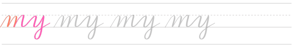
Curve to Curve Joins are similar, but they are just that much wigglier. Letter pairs like this can be fun to draw, as long as you plan ahead. An example is “my.”
Intro to Joins
Now that you have the basic strokes and letters under your belt, you may be wondering, “How on earth do I get these to connect so it looks like brush lettering?”
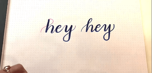
So yes, this is technically brush lettering because it’s done with a brush pen, but let’s connect these. First, we want to think about an ascender loop for our “H.” So we can start at the baseline, use a light stroke to go up and then transition into a heavy stroke. From here, we can do a slight curve under to transition into the “E.” And then finally, we can do a curve over-under to go into the “Y.” And then we also want to think about an exit stroke for the “Y.” So if we put this all together, here’s what it looks like.
So, let’s talk about various types of joins. Simple joins occur with an exit stroke between each letter. Many letters, even the ones that are stem-based, still end up having a curve under shape because of the exit stroke. A great example is the letter pair “I” and “T.” So if we think of the “I,” we have a simple stroke here. And then what we want to do is draw the next stroke of “T” right over the tail of the exit stroke for the “I,” like so. And then put it all together. So you can just see it’s a combination of two larger stem strokes that just meet up with one another.
Another simple join is a join to an oval. So it’s kind of the same idea here. If we have an “I” and then an “O” we have our “I” which is a simple stem with an exit stroke. And then with the “O,” we just plan ahead and kind of practice and get our thick stroke of our “O” to go over the tail of the “I” and then add an exit stroke. So if you put that all together, we get something like this.
Next, we have simple joins to ascender loops. It’s interesting with a simple join that goes to an ascender loop, because a lot of times the ascender loop can look like it’s disconnected from the previous exit stroke. And that’s because it is. And let me show you what I mean. If we have a “T” and an “L,” we have the “T” here and then to pick up from the “L,” you actually start at a different spot, go into your ascender loop and then connect it with the downstroke. So all together, it looks like this. And you can see how it makes the jump from this exit stroke to the beginning of the entrance stroke for the ascender loop.
Joins to curves are really interesting because it involves a lot of planning ahead. So say you have a letter pair “A” and “N.” So you have separated, you have your “A” right, and then you have your “N” like this.
So in order to plan ahead, you need to go from the exit stroke of the “A” and straight into the “N.” So all together, it looks like this. You can see it’s almost like singing. You have to know exactly when to take a breath and pause and then resume, and then take a breath and then resume and finish out your letter.
Horizontal Joins
Next we have horizontal joins. So horizontal joins are the ones that go from letters like “O,” “V,” and “W” that don’t go back to the baseline before the next letter starts. Let me show you what I mean.
If we have two “O’s” in a row, we have an “O” and another “O.” And in order to connect these two, you do a simple exit stroke between the two letters.
Similarly, if you have a “W” to an “A,” you start with the “W” and then do your small exit stroke, and then go right into the “A.” And you can see this very small, horizontal join here.
Finally, the last join is just the crossbar join. And this may go without saying, but letters with crossbars, like “T,” can be finished with one single crossbar instead of two separate crossbars. So if you have one “T” here and another “T” here, all you really need to do is do the two stems that connect with each other, and then cross them with one crossbar.
Complex Joins
With curve to curve joins, they’re similar to joins to curves, but they’re just a little bit wigglier. You have to make sure to plan ahead so that you go directly from the last exit stroke into the entrance stroke of your next letter. So with the letter pair “M” and “Y” I’ll show you what to do here.
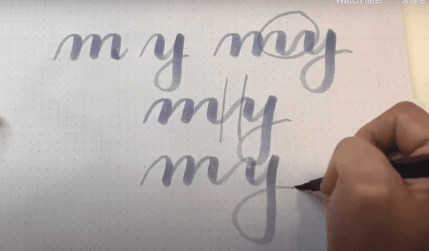
So you can see it’s just a lot of planning head in terms of where to take your next stroke.
Complex joins like this can be better differentiated when there is a bigger gap between the letters. So when you have these series of strokes combined with these series of strokes, you want to make sure that there’s enough separation so they read as two separate letters. I kinda messed up here to be honest.
So you see these two have a much bigger separation.
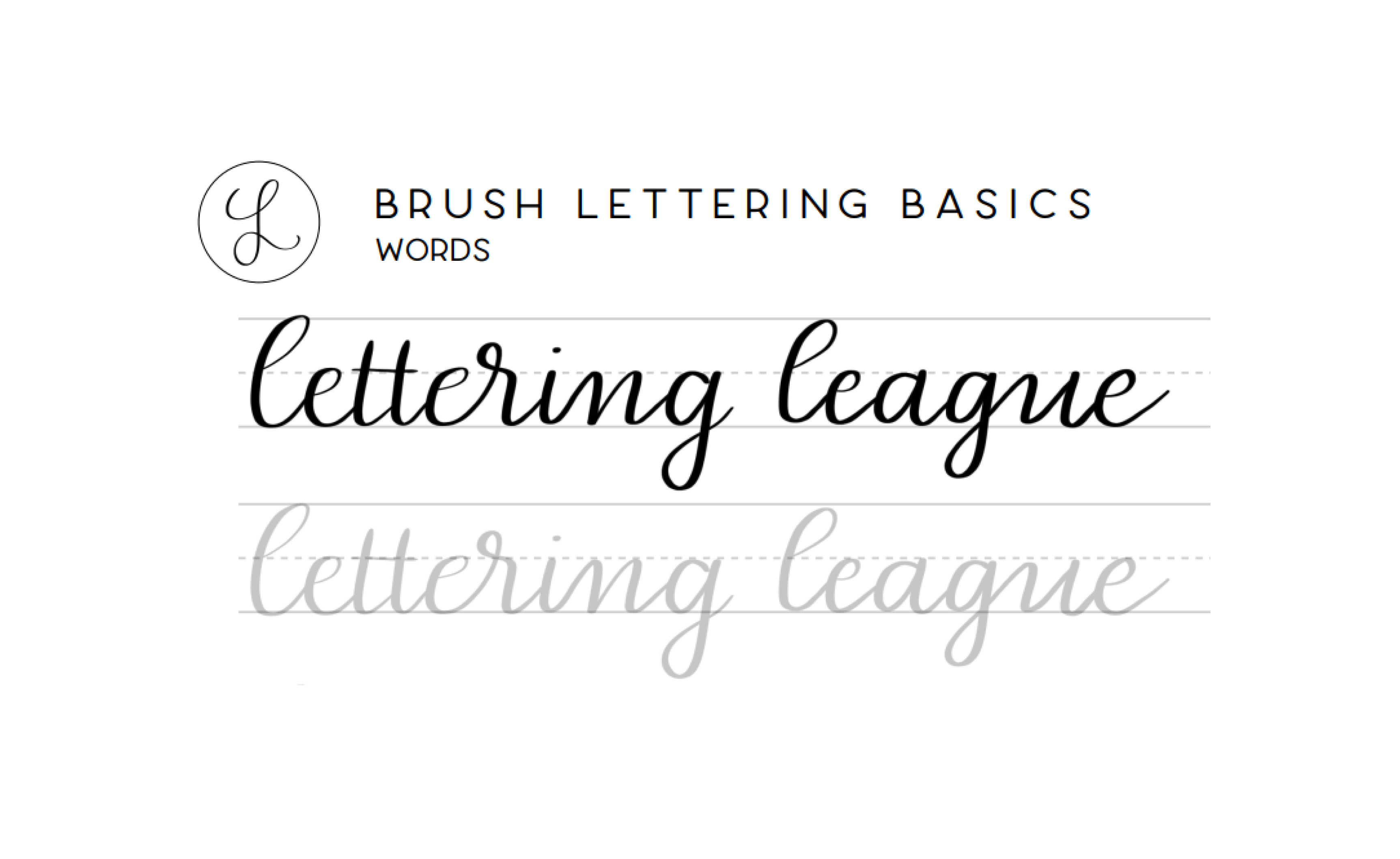
Brush Lettering Full Words
Now that we have individual letters and joins under our belt, it’s time to start drawing full words. One of my favorite words to practice with is the word “minimum” simply because it’s a combination of simple strokes that all combine together to form the word. So I’m going to go ahead and alternate between colors so you can see where I pick up the pen while I’m drawing the word.
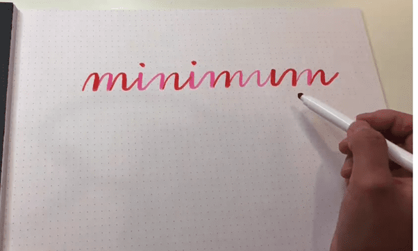
So you can see when it’s all drawn out there’s a whole lot of stuff going on here. There are some strokes that are a simple curve over another curve over this is a curve over-under, this is a curve under-over, and then it keeps going across the entire word. The most complex stroke here was this curve-over curve-under curve-over and under again between the M and the U. And you can just see how those start to tie together. You just need to think of the next stroke and the next letter that you’re going to be making. And then think about when is the next time you’re going to be able to pick up your pen. So if this is put altogether, here’s what it looks like. And I’ll use a different pen, so you can kind of get the idea.

So you see when you’re practicing your words, you want to make sure that all of your down strokes are consistent in size and in angle. And similarly, all of your upstrokes are going to be the same lightweight stroke. You want to practice and make sure again, all of these are the same angle. And you also want to differentiate a little bit between the different letters by adding a little bit more space between here, which is all one letter; and say here, which is between two letters. So again, just practice with it and keep going with the consistency, and pretty soon you’ll be able to nail this.
I would love to know what are some of your favorite words to practice when you’re brush lettering, when you’re practicing, make sure to share your work on Instagram and use #LetteringLeague.
Daily Practice + Next Steps
Now that you have basic strokes, letters, joins, and letter pairs under your belt, it’s time to practice a lot. By showing up every day to practice your craft with intention, you’ll start to see improvements in your brush lettering… very fast. Notice how I said that you want to practice with intention. And in order to do this, you can set a S.M.A.R.T. goal.
A S.M.A.R.T. goal is specific. First. You want to make sure that your goal is very specific. The more specific, the better. So a very specific goal is going to sound like this, “I will practice brush lettering every other day in order to improve my skills so I can become a professional calligrapher.” And something less specific might be like, “I’m just going to practice brush lettering when I feel like it.” Aim to make your goal as specific as possible, so that it’s aligned with what your ultimate desires are.
Next, you want to make sure your S.M.A.R.T. goal is measurable. And in order to do this with brush lettering, you can practice in one notebook and date all the pages so that you can see your progress as you go along. Pretty soon, you’ll be able to look back and see how much your lettering has improved over time.
Your goal also needs to be achievable, and that means it needs to be realistic. So if you sit down and plan to be a self-employed professional calligrapher within a month, but you haven’t even ordered any supplies yet, your goal might not be achievable. Also make sure your practice schedule fits around your life. Meaning your daily work, your errands, your kids, and your family and friends.
Your goal should also be results-focused. This relates a lot to specificity, but it’s also different. So making time to practice brush lettering every day is one thing. But making time to improve on an area in which you struggle is another. For example, if you sat down and wrote out the chorus to your favorite song lyrics every day for half an hour, you probably won’t improve as much as if you aim to improve a specific join or letter pair that you’re having difficulty with during a 30 minute session. So focus on improving your craft on the schedule you set, not just sitting down at your desk to check off the days to do list.
Finally, your goal should be time-bound. You want to make sure that every day that you practice, whether it’s every day, every other day, whatever you choose, has a specific time set to it. So you might say something like, “I want to practice for 15 to 60 minutes every morning before I have breakfast,” which sounds a lot more specific and time bound than, “I just want to practice brush lettering after dinner.”
The other thing that needs to be time-bound is your overall goal. A great time-bound goal is that you might want to learn brush lettering now, so that in eight months you’ll be able to launch an Etsy shop that runs on pre-made work as well as commissions. A similar but less time-bound goal might sound something like, “I just want to launch in the Etsy shop with my hand lettering.”
You can see the difference when you are setting S.M.A.R.T. goals, versus when you’re just setting a kind of fuzzy goal.
What’s Next In The World of Lettering?
So now that you’ve mastered brush lettering basics, let’s talk about what’s next in your journey.
A great place to start is with cursive worksheets. You can try a whole bunch of different cursive styles in order to develop your own personal brush lettering style.
Another place to go is to try different materials, whether you try chalkboard lettering or watercolor lettering, or even trying to brush letter with vegetables. And yes, that’s a real thing. If you Google it, you’ll find it. It’s really cool.
As you go along and learn new things, make sure to share your work publicly. This is a really good way to hold accountability to yourself and others while you’re learning brush lettering.
If brush lettering has sparked your love of drawing and mark-making, Improved Drawing’s beginner pencil guide is a great next read — the same sensitivity to pressure and line quality that makes brush lettering beautiful applies to pencil drawing too.
If you want to add premium brush textures to your digital lettering work, Artixty carries an incredible 1000+ Digital Hand Painted Brush Strokes collection that pairs beautifully with Procreate and Photoshop. They also offer a gorgeous Watercolor Assets Bundle with textures and overlays that complement watercolor brush lettering compositions.
Thank you again so much for joining us at Brush Lettering Basics. Make sure to share the course of people who you think might love this, and I’ll see you around.
Leave a Reply