Are you looking to take your digital lettering game to the next level? Procreate is an incredible tool for creating stunning designs, but unlocking its secrets can elevate your work from good to extraordinary. In today’s post, our seasoned Lettering and Illustration artist Sooraj will teach us a few magical techniques that can make your artwork stand out.
The secret lies in how you creatively use Procreate’s tools and features to add textures, effects, and subtle enhancements to your artwork. These five tips are what I use in my lettering pieces which will show you how to make your lettering pop. And as a bonus, I’m including some extra tips to help you go even further!
Table of Contents
1. Add Grain Texture to Your Background
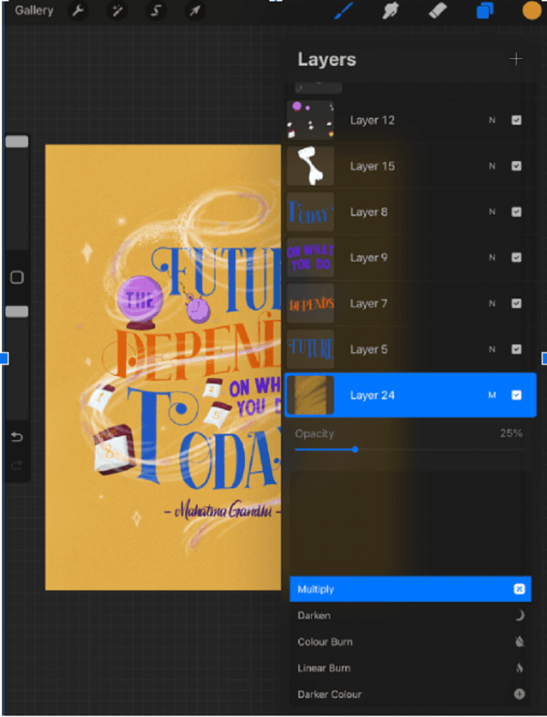
A subtle grain texture can add richness and dimension to your lettering pieces. Create a new layer above your background color and use any kind of grain brush, select your preferred color and paint on it. Then set the layer to “Multiply” and adjust the opacity to your liking. This creates a nice textured feel and adds visual interest without overwhelming the lettering itself.
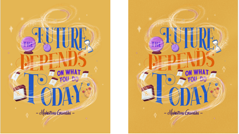
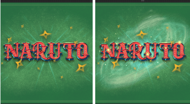
Bonus Tip: Want to make your grain texture even more dynamic? Create another layer on top of this, but this time focus on applying the texture in the center of the canvas (like a gradient).
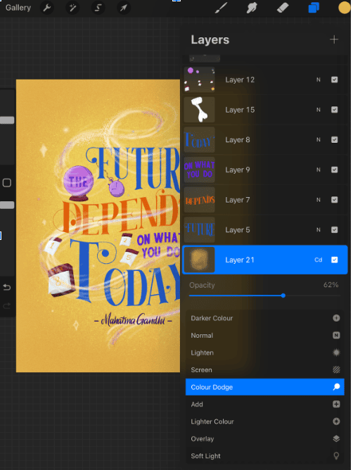
Now Set the blending mode to “Add” or “Color Dodge” and adjust the opacity to enhance the glowing effect.
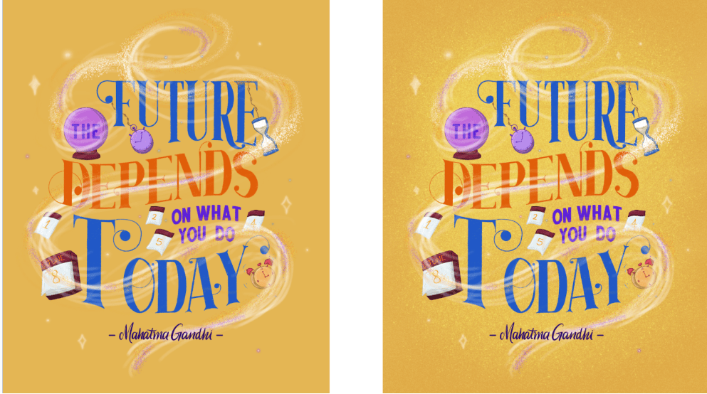
(Before and After)
2. Use a Solid Color Overlay
This simple yet effective technique can tie together the entire design with a unified tone. Create a new layer on top of everything and fill it with a solid color.
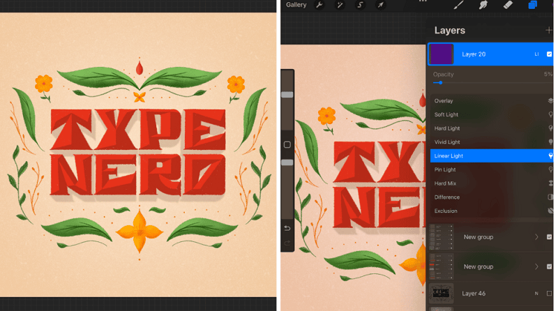
Experiment with blending modes like “Overlay,” “Soft Light,” or “Hard Light” to see what works best, and then tweak the opacity to achieve the desired effect.
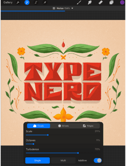
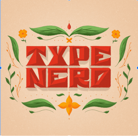
Bonus Tip: To add even more texture and depth, Go to the adjustments menu and select “Noise”, apply just the right amount of noise for an edgy, textured look.
3. Experiment with Chromatic Aberration
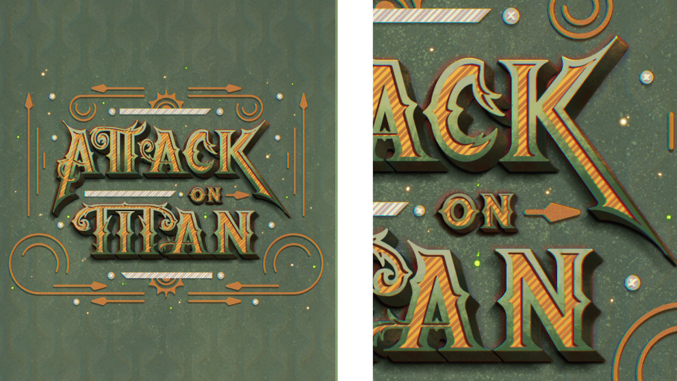
Chromatic aberration is a subtle effect that can make your letters or illustrations stand out. This adjustment gives a color-shifting, slightly blurred edge to objects, mimicking a photographic or digital distortion.
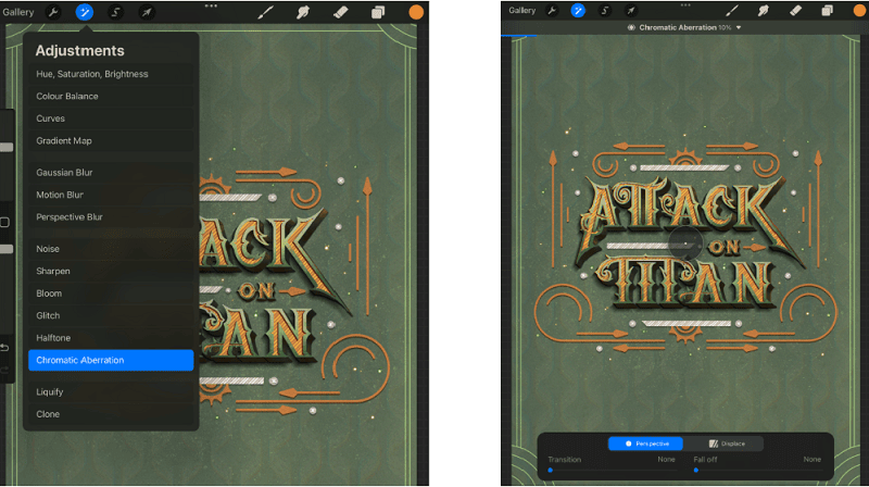
Apply it directly by selecting the layer and going to the adjustments menu and select “Chromatic Aberration” to your lettering or illustrations for an intriguing, high-quality effect.
Bonus Tip: For giving a bit more magical feeling to it, duplicate your lettering layer or any other layer where you want to apply this effect, and on the bottom layer, Go to adjustments and select Chromatic Aberration.
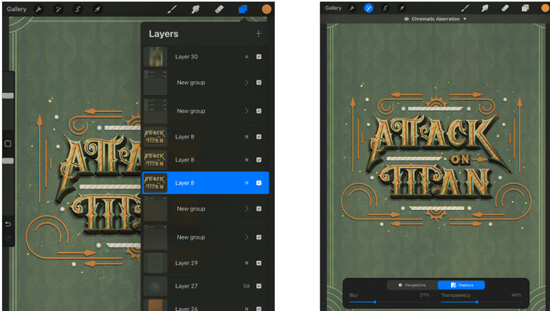
In this menu go to “Displace” then tap on the screen and move the dispersed colors slightly and then increase the blur value close to maximum. This creates a glowing, 3D-like effect that feels dynamic and immersive.
4. Add motion for Blur Movement
Bring your lettering to life by adding motion! Motion blur is a fantastic way to create the illusion of movement or emphasize specific areas of your design.
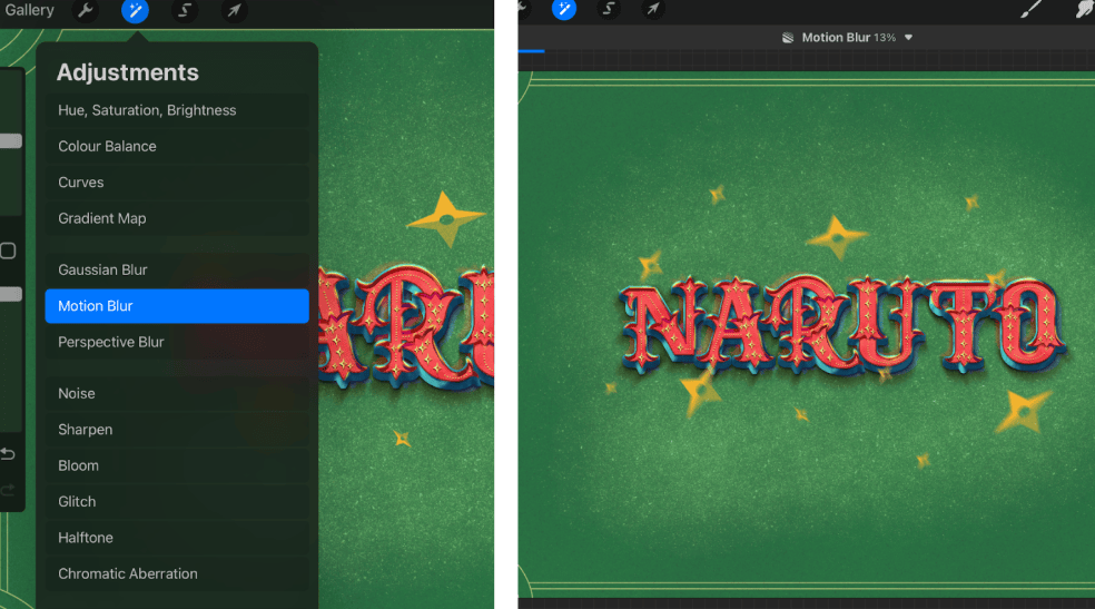
Select the layer where you want to show the movement then go to Adjustments and select “Motion Blur”. Now tap on the screen and move towards the direction where you want the movement to happen. This creates a sense of energy and flow.
Bonus Tip: For giving a bit more realistic effect to it, you can duplicate the layer and create a shadow for the object. Then apply the same motion blur to the shadow as well, change its blending mode and adjust the opacity according to your preference.
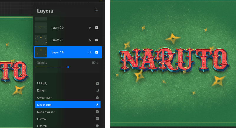
You can also mix and use other blur effects in the adjustments menu like the “Perspective Blur & Gaussian Blur”.
5. Enhance Colors with the Bloom Effect
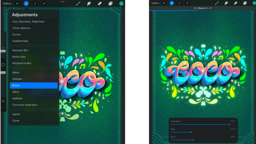
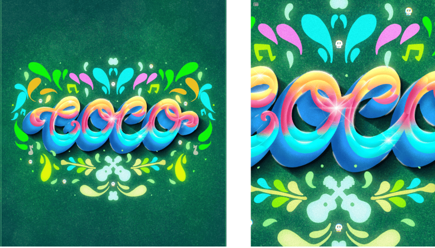
If you want to make your lettering shine, use the Bloom feature to amplify its colors. The Bloom effect adds a soft glow to the brighter areas of your artwork, creating a dreamlike radiance.
Select the layer, go to adjustments and select “Bloom” then adjust the intensity to suit your design, and watch your colors come alive.
Conclusion
With these techniques, you can transform your digital lettering pieces into true works of art that grab attention. Start experimenting with these methods today, and don’t be afraid to make them your own by combining effects and layers!
Which tip are you most excited to try?
Share your thoughts or your creations with the lettering community!

Leave a Reply